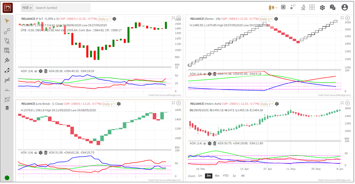
You will see three lines, that forms part of the ADX indicator, appearing in the lower pane in the chart below. Let us understand them.
Before we understand the ADX & its components, it is important to sort out a few concepts. Let us start with the Range.
Range of any candle is a difference between the High and Low price.
J.Welles Wilder introduced a concept called True Range.
Formula of True Range:
Maximum of (Current High – Current Low, Current Low – Prev Close, Current High – Prev Close)
The average price of true range over last several candles is known as Average True Range. 14-day period suggested by Wilder is popular and widely used parameter for ATR.
J. Welles Wilder has also developed popular indicators such as RSI and ADX.
He used a different method of averaging for these indicators. Method of averaging is different from SMA, EMA, WMA etc that we use otherwise.
Formula for Wilder’s averaging method if you are plotting a 14-period average:
((Prev reading x (13)) + Current reading) / 14
A 14-day ATR is average true range of last 14 days. It measures the volatility of any instrument. This is the first component in ADX calculation.
Wilder method of averaging is used for calculating ATR and other averages in the indicator.
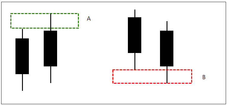
Next step is, calculate the difference between high of current candle & previous candle. Let’s call it A.
Difference between low of current candle with previous candle is B.
If there is a new high in current candle it is bullish, if there is a new low, it is bearish.
So, there are four possibilities for defining direction in every candle. See the image.
This way, we can define Direction on every bar. We will only take bullish and bearish direction bars into account.
Average of all bullish direction movement and bearish direction movement over last 14-day is calculated. By this, we get to know about average bullish and bearish direction range.
If we divide Bullish direction by ATR (Volatility) we get Bullish Directional Movement Indicator (+DMI).
Same way, Bearish direction divided by ATR is Bearish Directional Movement indicator.
Directional movement indicator = Direction / Volatility.
Green line in below chart is Bullish DMI+ line and Red line is DMI- line as explained above.
When bullish is above bearish, more bars are in a positive direction hence trend is bullish. When bearish line is above bullish line the trend is bearish.
So, now we have bullish and bearish DMI lines on the chart.
How to know who in control and how much?
If I have 5 green balls and 10 red balls in a basket.
Who has majority? Red balls? What’s their strength?
They have 5 balls more than green. Total balls in the basket are 15. So, their strength is ~33%.
Got it?
his is how DX is calculated. Average of DX is ADX. It captures the strength of the trend that is in control.
How to know what is the trend? The positioning of the DMI lines shows us that.
So basic interpretation of the ADX indicator would be:
If the DMI+ > DMI- line and ADX is rising = Trend is bullish and strong.
If the DMI+ < DMI- line and ADX is rising = Trend is bearish and strong.
What is the best strategy using ADX? You will find thousands of blogs, videos etc on this. But you will never be able to implement that unless time is spent in understanding the logic behind construction.
ADX above 25 shows strength of the trend. Next question should be how? If it makes sense to you, it can be part of your system. There are many ways of reading this indicator and some people follow it rigorously.
Their interpretation on noiseless charts such as P&F, Renko & Line-break is even more interesting.


Comments